CAN DESIGN SOLVE THE WORKER SHORTAGE?
For the manufacturing industry, a worker shortage is just about the worst thing that could happen (maybe next to calculators going extinct?).
To gather and organize a team of scientists, engineers, sales people, administrators, and more, is nothing less than a herculean. It’s a massive, intricate production.
For all my fellow Minnesotans, this worker shortage might seem particularly bad— and that’s because it is for us. In terms of the worker shortage, the U.S. Chamber of Commerce counts Minnesota as one of the states most impacted.
I’m not entirely surprised. It’s a challenge my clients often bring up. It follows that I’ve thought a lot about this issue. Mining my own experiences— both as a marketing-minded graphic designer and a business owner— I have some thoughts to offer.
Finding Great Talent: First Impressions
“If you’re trying to create a company, it’s like baking a cake. You have to have all the ingredients in the right proportion.” ~ Elon Musk
Plain and simple, you can’t build the right team without the right players.
(On a rather corny side note, what cake ingredient do you think you’d be? I think I’d be the food coloring because I bring the color!)
Think about how the average person goes about their job hunt these days. It’s almost entirely online— not a whiff of human interaction until the interview stage. (Even then, many companies are turning to asynchronous job interviews, with interviewees submitting recorded video answers for hiring reps to watch later on.)
That means that in the hiring stage, what your potential employee interacts with— more than anything else— is your branding: your social media presence, your website design, your copywriting, your logo, wordmark, etc.
For an applicant, the pieces of branding are clues, hinting at what kind of company you are.
If you want to be a progressive, modern employer: ensure that your logo isn’t ten years behind design trends. If you want to be an engaging, exciting business, keep your social media alive. If you want to be a clear, communicative company, make sure your website is helpfully stocked with information.
Whatever it is, your first impression is the start (and possibly the end) of everything.
Keeping Great Talent: Nurturing Company Culture
If you asked me to describe my ideal workplace back when I graduated (which was a loooooong time ago), I probably would’ve gone with “fun and exciting.”
Back then, business culture was totally different. Think of the movie The Social Network. If there were bean bags, beer taps, and xboxes in your break room, you’d “made it.”
That’s not the case anymore.
One pandemic and more than one economic downturn later, people are more practical. Burn out prevention, mental health support, strong benefits, paid time off, work life balance— these are what employees prioritize.
If you asked me about my ideal workplace now, it’d be “supportive and respectful.”
Graphic design isn’t going to land you a great employee 401K program. But a lot of these priorities stem from having the right company culture— and culture is nurtured by our surroundings.
What surrounds you in a typical office environment? Well, let’s start with the literal: walls.
Keep Your Ideals Front and Center
This is a large design I put together for Trystar.
Putting up an installation like this is akin to writing your goals down on a sticky note and sticking it to your desktop screen. It’s basic psychology— if you want to keep something front and center, keep it literally front and center.
Walls like these rally teams around shared ideals, show visitors what you’re all about, and add a pop of color to boot!
Make it Seen
Humans are visual creatures. It’s why our heart rate quickens at the color red and our body releases endorphins at the sight of someone smiling.
If you want to establish company values, and you don’t use some kind of visual language, you simply aren’t making the most of it.
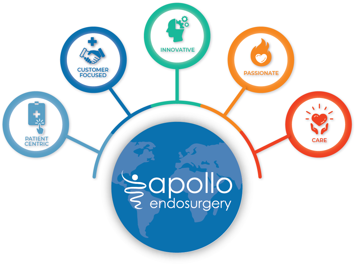
Take Apollo Endosurgery’s value icons, which each embody and affirm what they stand for. They can be put on company notepads, pens, signage, and more.
Like the great company that they are, Apollo keeps ongoing conversations about their values, regularly breaking out into established subcommittees for discussion. Talking about values can get very ambiguous— these icons are a way to ground the conversation and keep them on track.
Keep Growing!
If there’s one thing the last few years of hardship have given us, it’s knowledge. We know better than ever what makes a company resilient and progressive, and now we can use that information to grow for the better.
As you seek to improve yourself and your company, my job as your friendly graphic designer is kind of like that friend who’s helping you get ready for a first date: Remember, appearances matter!


