How TearSolutions Secured $5 Million Dollars of Funding With the Help of an Elevated Brand
“People make snap judgements every day and investors are no different. They want to know that they are dealing with companies that represent themselves in a professional manner and our brand is a huge part of that.” — Anil Asrani, President & CEO of TearSolutions, Inc.

When TearSolutions embarked on their journey to revolutionize ocular health, they knew they needed more than just groundbreaking science; they needed a brand that would convey their expertise, unite stakeholders, and leave a lasting impression. As a strategic freelance graphic designer and fractional art director, that's where I came in!
“I had known Danielle for more than a decade and knew she was in the field of design. I was looking to renew our company’s brand, and I wanted to work with someone I knew and trusted so I reached out to her.
“I remember Danielle’s responsiveness, her eagerness to work diligently and creatively to meet the objectives we laid out.” —Anil
The Vision: Elevated Branding for Scientific Innovation
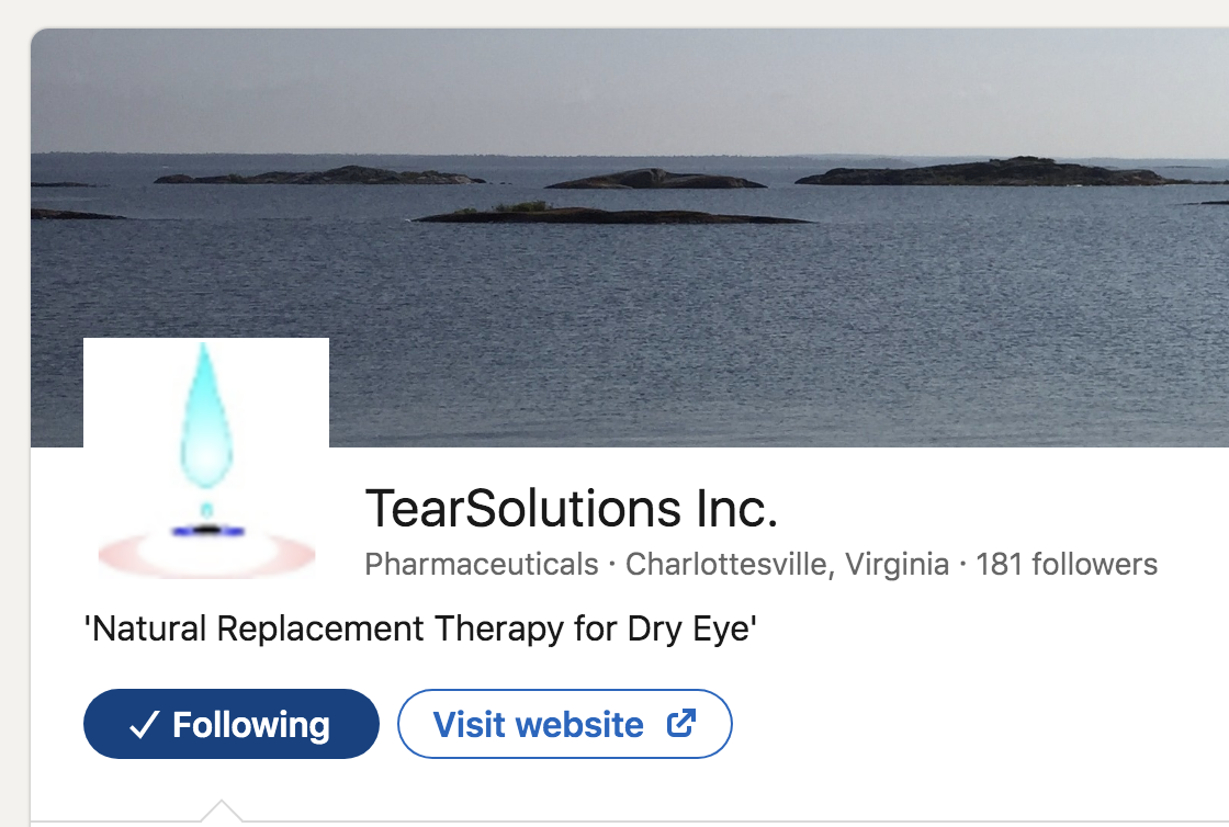
Tearsolution’s LinkedIn page, before their updated branding
When TearSolutions, founded by Dr. Gordon Laurie, set out on their mission, they made a remarkable finding. They discovered a natural tear protein called 'Lacritin' that plays a crucial role in all types of Dry Eye.
Building on this, they developed 'Lacripep,' a peptide therapeutic that preserves all of Lacritin's healing properties and can be easily manufactured.
The TearSolutions team continued to see success in their first-in-human trial, and their breakthrough had the potential to change the lives of countless people struggling with Dry Eye.
But for TearSolutions to continue their great work, they needed more financial resources.
Creating an Effective Brand Identity
When TearSolutions approached me, they had three key goals in mind:
1) Credibility: They sought to establish themselves as pioneers in ocular health and dry eye treatment product development.
2) Loyalty: Their aim was to forge a unified message that would resonate with employees, investors, and patients alike.
3) Brand Recognition: TearSolutions wanted their stakeholders, clients, and beyond to instantly recognize the connection between the company, its imagery, and its messages.
The Visual Identity: A Fusion of Science and Compassion
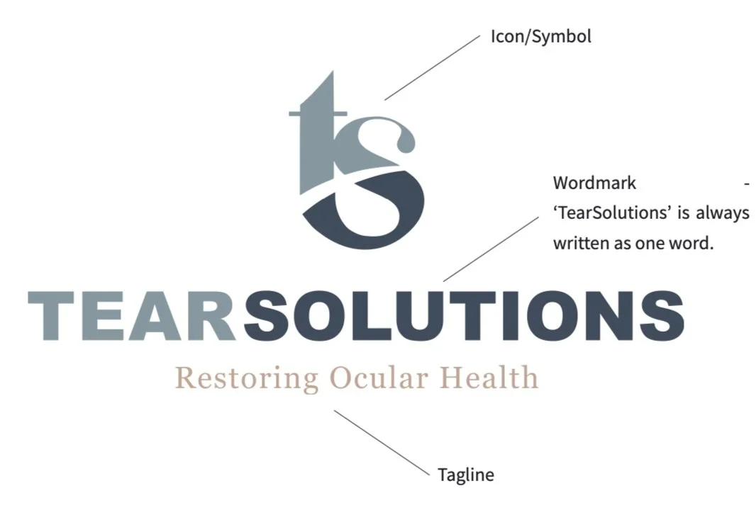
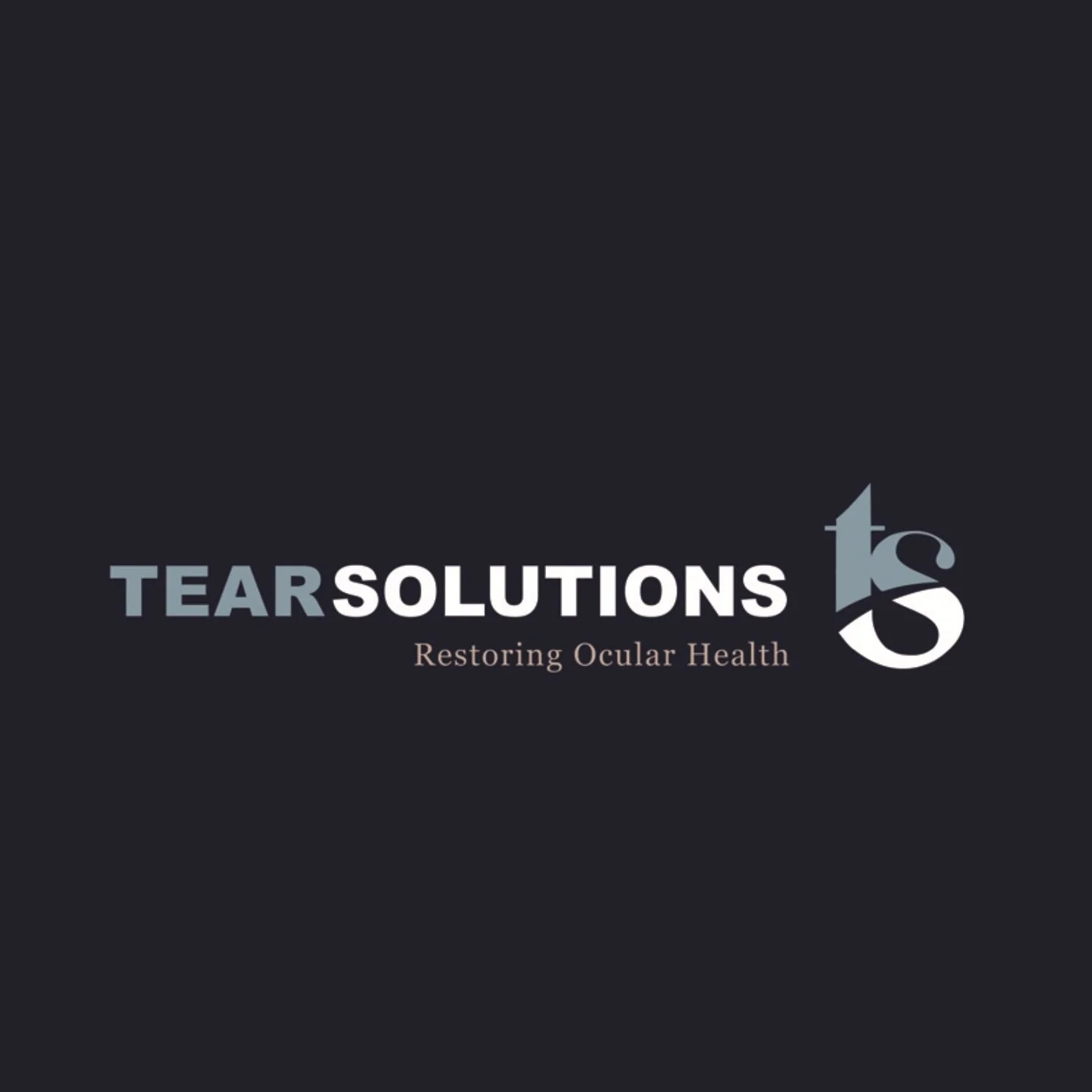
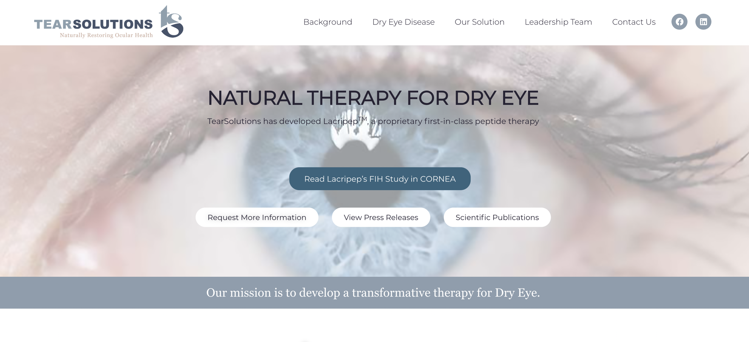
The TearSolutions logo reflects their mission.
The icon combines the initials to form a teardrop, subtly alluding to an eye by using negative space. Fluid curves reflect their natural approach.
The wordmark, with its strong, sturdy sans-serif font, adds structure and weight to the rounded teardrop symbol.
The tagline, in a classic serif font, sets an educational and serious tone, underscoring the expertise of their physician-led team. Put together, these elements create a nice balance!
Colors that Convey Trust and Warmth

A brand's color palette speaks volumes.
For TearSolutions, I selected warm-toned neutrals and calming blues. These hues not only evoke trust and security but also exude a sense of warmth and approachability.
This carefully curated palette would resonate with both patients seeking solace and investors looking for a reliable partner.
The Brand Style Guide: A Blueprint for Consistency and Trust
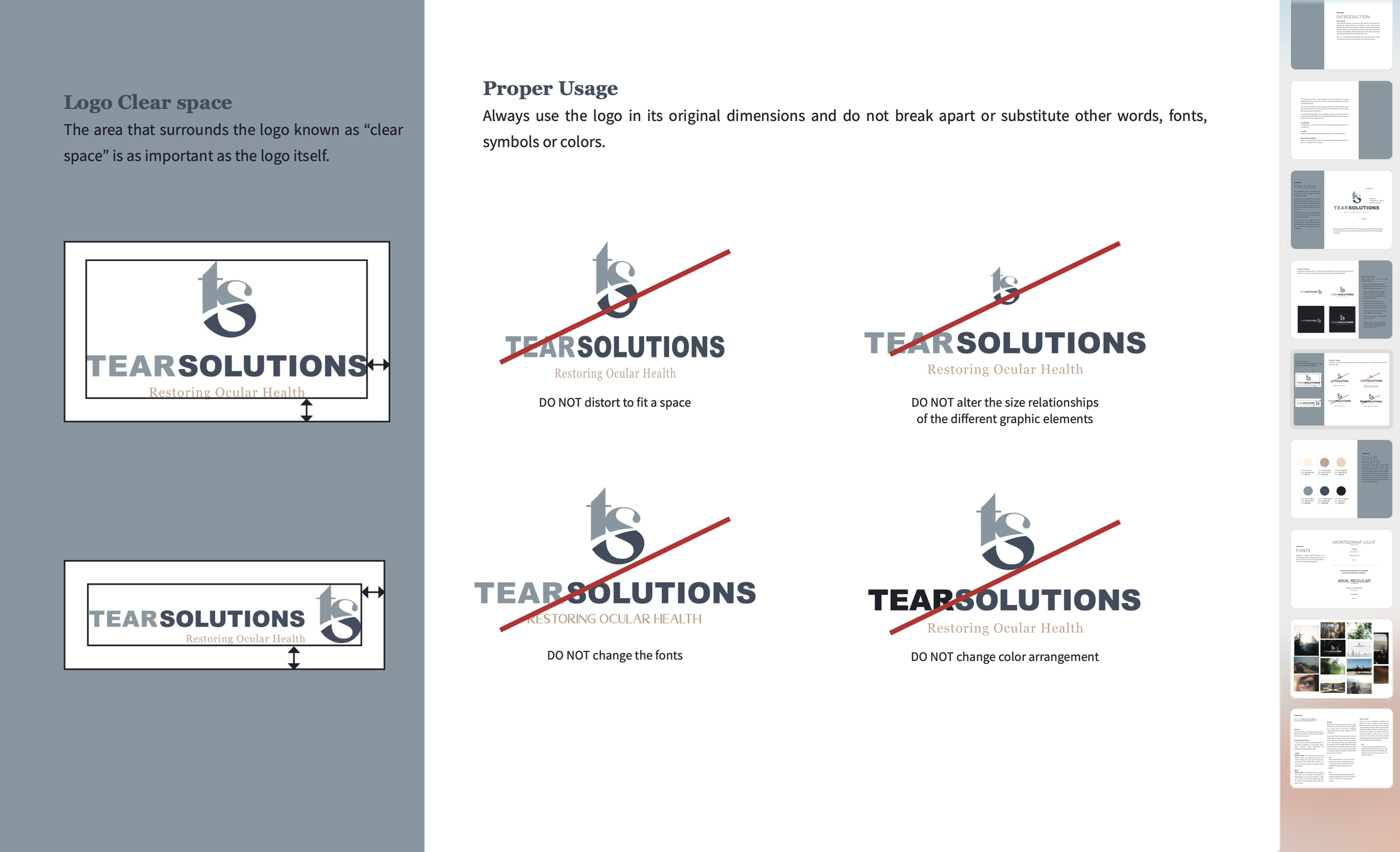
In addition to the visual elements, I provided TearSolutions with a comprehensive brand style guide. This invaluable resource empowers them to effectively wield their branding elements - colors, fonts, and logos.
The guide not only optimizes the impact of their branding efforts but also consistently fosters trust, brand recognition, and loyalty.
Building on the Brand: A Fresh Website
Branding is the foundation of every great website, and a great website is essential for companies looking to grow. That’s why I often encourage my clients to consider a site update if they’re already investing in branding.
“The web designers were referrals from Danielle, so she helped us find someone who was responsive and already worked well with her.
“Again, our website, much to the credit of Danielle communicating with the web design team, exceeded our expectations. It took our website from something that was basic and word-based to something modern and visually appealing. Her work also influenced our investor presentations that we used to attract new investors.” —Anil
Securing $5 Million in Investor Funding: A Testament to Effective Branding

“After our rebranding, we successfully raised a $5.6 million dollar bridge financing. Our investors were very impressed with the new look and feel of our company. They even provided unsolicited feedback about how proud they were to be part of our story and enjoyed pointing people to our website, etc.
“Danielle’s work allowed us to present ourselves in a much more professional manner and greatly contributed to our credibility.” — Anil
The impact of TearSolutions' reimagined brand was swift and profound. With their new visual identity, TearSolutions radiated credibility, united stakeholders, and achieved brand recognition beyond their expectations. This powerful brand transformation played a pivotal role in securing a remarkable $5.6 million dollars in investor funding!
TearSolutions' success story stands as a testament to the relationship between scientific innovation and strategic branding. Together, we elevated their brand, magnifying its impact. Their story is a great example of how effective branding can amplify the reach and influence of groundbreaking scientific endeavors!